ProScalper📊 ProScalper - Professional 1-Minute Scalping System
🎯 Overview
ProScalper is a sophisticated, multi-confluence scalping indicator designed specifically for 1-minute chart trading. Combining advanced technical analysis with intelligent signal filtering, it provides high-probability trade setups with clear entry, stop loss, and take profit levels.
✨ Key Features
🔺 Smart Signal Detection
Range Filter Technology: Fast-responding trend detection (25-period) optimized for 1-minute timeframe
Medium-sized triangles appear above/below candles for clear buy/sell signals
Only most recent signal shown - no chart clutter
Automatically deletes old signals when new ones appear
📋 Real-Time Signal Table
Top-center display shows complete trade breakdown
Grade system: A+, A, B+, B, C+ ratings for every setup
All confluence reasons listed with checkmarks
Score and R:R displayed for instant trade quality assessment
Color-coded: Green for LONG, Red for SHORT
📐 Multi-Confluence Analysis
ProScalper combines 10+ technical factors:
✅ EMA Trend: 4 EMAs (200, 48, 13, 8) for multi-timeframe alignment
✅ VWAP: Dynamic support/resistance
✅ Fibonacci Retracement: Golden ratio (61.8%), 50%, 38.2%, 78.6%
✅ Range Filter: Adaptive trend confirmation
✅ Pivot Points: Smart reversal detection
✅ Volume Analysis: Spike detection and volume profile
✅ Higher Timeframe: 5-minute trend confirmation
✅ HTF Support/Resistance: Key levels from higher timeframes
✅ Liquidity Sweeps: Smart money detection
✅ Opening Range Breakout: First 15-minute range
💰 Complete Trade Management
Entry Lines: Dashed green (LONG) or red (SHORT) showing exact entry
Stop Loss: Red dashed line with price label
Take Profit: Blue dashed line with price label and R:R
Partial Exits: 1R level marked with orange dashed line
All lines extend 10 bars for clean alignment with Fibonacci levels
📊 Dynamic Risk/Reward
Adaptive R:R calculation based on market volatility
Targets adjusted for pivot distances
Minimum 1.2:1 to maximum 3.5:1 for scalping
Position sizing based on account risk percentage
🎨 Professional Visualization
Clean chart layout - no clutter, only essential information
Custom EMA colors: Red (200), Aqua (48), Green (13), White (8)
Gold VWAP line for key support/resistance
Color-coded Fibonacci: Bright yellow (61.8%), white (50%), orange (38.2%), fuchsia (78.6%)
No shaded zones - pure price action focus
📈 Performance Tracking
Real-time statistics table (optional)
Win rate, total trades, P&L tracking
Average R:R and win/loss ratios
Setup-specific performance metrics
⚙️ Settings & Customization
Risk Management
Adjustable account risk per trade (default: 0.5%)
ATR-based stop loss multiplier (default: 0.8 for tight scalping)
Dynamic position sizing
Signal Sensitivity
Confluence Score Threshold: 40-100 (default: 55 for balanced signals)
Range Filter Period: 25 bars (fast signals for 1-min)
Range Filter Multiplier: 2.2 (tighter bands for more signals)
Visual Controls
Toggle signal table on/off
Show/hide Fibonacci levels
Control EMA visibility
Adjust table text size
Partial Exits
1R: 50% (default)
2R: 30% (default)
3R: 20% (default)
Fully customizable percentages
Trailing Stops
ATR-Based (best for scalping)
Pivot-Based
EMA-Based
Breakeven trigger at 0.8R
🎯 Best Use Cases
Ideal For:
✅ 1-minute scalping on liquid instruments
✅ Day traders looking for quick 2-8 minute trades
✅ High-frequency trading with 8-15 signals per session
✅ Trending markets where Range Filter excels
✅ Crypto, Forex, Futures - works on all liquid assets
Trading Style:
Timeframe: 1-minute (can work on 3-5 min with adjusted settings)
Hold Time: 3-8 minutes average
Target: 1.2-3R per trade
Frequency: 8-15 signals per day
Win Rate: 45-55% (with proper risk management)
📋 How to Use
Step 1: Wait for Signal
Watch for green triangle (BUY) or red triangle (SELL)
Signal table appears at top center automatically
Step 2: Review Confluence
Check grade (prefer A+, A, B+ for best quality)
Review all reasons listed in table
Confirm score is above your threshold (55+ recommended)
Note the R:R ratio
Step 3: Enter Trade
Enter at current market price
Set stop loss at red dashed line
Set take profit at blue dashed line
Mark 1R level (orange line) for partial exit
Step 4: Manage Trade
Exit 50% at 1R (orange line)
Move to breakeven after 0.8R
Trail remaining position using your chosen method
Exit fully at TP or opposite signal
🎨 Chart Setup Recommendations
Optimal Display:
Timeframe: 1-minute
Chart Type: Candles or Heikin Ashi
Background: Dark theme for best color visibility
Volume: Enable volume bars below chart
Complementary Indicators (optional):
Order flow/Delta for institutional confirmation
Market profile for key levels
Economic calendar for news avoidance
⚠️ Important Notes
Risk Disclaimer:
Not financial advice - for educational purposes only
Always use proper risk management (0.5-1% per trade max)
Past performance doesn't guarantee future results
Test on demo account before live trading
Best Practices:
✅ Trade during high liquidity hours (9:30-11 AM, 2-4 PM EST)
✅ Avoid news events and market open/close (first/last 2 minutes)
✅ Use tight stops (0.8-1.0 ATR) for 1-minute scalping
✅ Take partial profits quickly (1R = 50% off)
✅ Respect max daily loss limits (3% recommended)
✅ Focus on A and B grade setups for consistency
What Makes This Different:
🎯 Complete system - not just signals, but full trade management
📊 Multi-confluence - 10+ factors analyzed per trade
🎨 Professional visualization - clean, focused chart design
⚡ Optimized for 1-min - settings specifically tuned for fast scalping
📋 Transparent reasoning - see exactly why each trade was taken
🏆 Grade system - instantly know trade quality
🔧 Technical Details
Pine Script Version: 5
Overlay: Yes (plots on price chart)
Max Lines: 500
Max Labels: 100
Non-repainting: All signals confirmed on bar close
Alerts: Compatible with TradingView alerts
📞 Support & Updates
This indicator is actively maintained and optimized for 1-minute scalping. Settings can be adjusted for different timeframes and trading styles, but default configuration is specifically tuned for high-frequency 1-minute scalping.
🚀 Get Started
Add ProScalper to your 1-minute chart
Adjust settings to your risk tolerance
Wait for signals (green/red triangles)
Follow the signal table guidance
Manage trades using provided levels
Track performance with stats table
Happy Scalping! 📊⚡💰
"stop loss"に関するスクリプトを検索

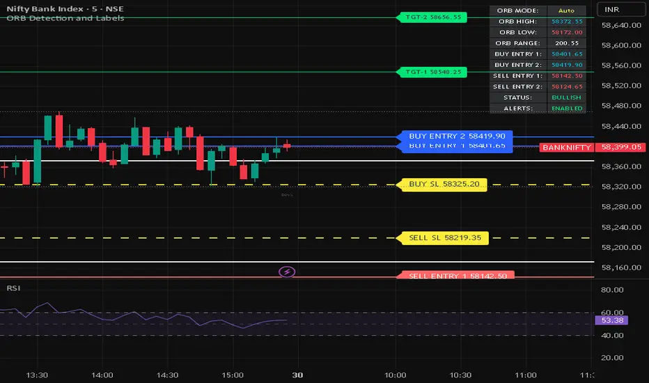
ORB Detection and LabelsOverview
ORB Detection and Labels is a comprehensive Opening Range Breakout (ORB) indicator designed for Indian market traders focusing on indices and stocks. This advanced tool automatically calculates critical trading levels based on the first 15 minutes of trading (09:15-09:30 IST) and provides precise entry, target, and stop-loss levels.
Key Features
Dual Operating Modes:
Auto Mode: Automatically detects and calculates ORB during market hours on 1/3/5/15-minute charts
Manual Mode: Allows custom ORB input for any timeframe including daily, weekly, and higher timeframes
Precision Trading Levels:
2 Buy Entry Levels
2 Sell Entry Levels
Dynamic Stop Loss levels
3 Target levels per direction
Visual Clarity:
Color-coded horizontal lines for instant recognition
Customizable label positioning to avoid chart clutter
Real-time info panel displaying all critical levels and status
Clean, professional interface with adjustable colors
Smart Alert System:
Configurable alerts for entry levels, stop losses, and targets
Non-repainting alerts that fire on bar close
Separate toggles for entry, target, and SL alerts
How It Works
ORB Calculation: During 09:15-09:30 IST, the indicator tracks the high and low to establish the Opening Range
Level Generation: After 09:30, it calculates buy/sell entries, stop losses, and targets using proprietary Fibonacci ratios
Visual Display: Lines extend across the chart with labels positioned for easy reading
Daily Reset: Automatically resets each trading day for fresh analysis
Ideal For
Intraday traders
Swing traders using manual ORB input on daily charts
Traders following opening range breakout strategies
Those seeking clear, mechanical entry and exit levels
Technical Specifications
Works on all symbols
Best suited for 1, 3, 5, and 15-minute timeframes in Auto mode
Manual mode supports all timeframes
Timezone: GMT+5:30 (IST)
Unique Advantages
✅ No repainting - all calculations finalize after ORB session closes
✅ Customizable colors and label positions
✅ Built-in risk management with defined SL levels
✅ Multiple profit targets for partial exit strategies
✅ Works across timeframes with manual override option
✅ Professional info panel with real-time status updates
Settings
ORB session timing (default: 09:15-09:30, 15 minutes)
Manual ORB high/low inputs
Label offset adjustment
Toggle targets, labels, info table
Alert preferences
Complete color customization
Perfect for traders who value precision, clarity, and systematic trading approaches based on proven ORB methodology.
This Script is Just for Educational Purpose. Please test it as per your risk. This is not a recommendation.
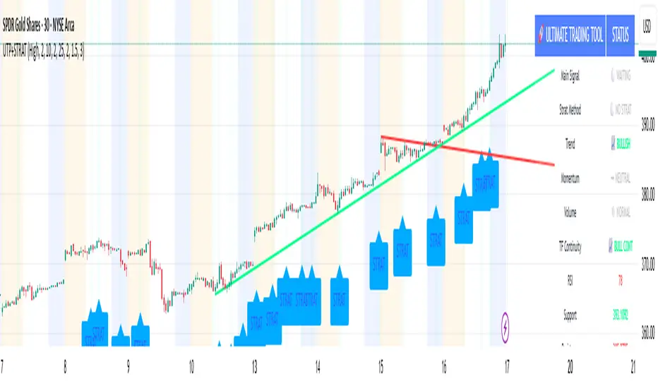
🚀 Ultimate Trading Tool + Strat Method🚀 Ultimate Trading Tool + Strat Method - Complete Breakdown
Let me give you a comprehensive overview of this powerful indicator!
🎯 What This Indicator Does:
This is a professional-grade, all-in-one trading system that combines two proven methodologies:
1️⃣ Technical Analysis System (Original)
Advanced trend detection using multiple EMAs
Momentum analysis with MACD
RSI multi-timeframe analysis
Volume surge detection
Automated trendline drawing
2️⃣ Strat Method (Pattern Recognition)
Inside bars, outside bars, directional bars
Classic patterns: 2-2, 1-2-2
Advanced patterns: 3-1-2, 2-1-2, F2→3
Timeframe continuity filters
📊 How It Generates Signals:
Technical Analysis Signals (Green/Red Triangles):
Buy Signal Triggers When:
✅ Price above EMA 21 & 50 (uptrend)
✅ MACD histogram rising (momentum)
✅ RSI between 30-70 (not overbought/oversold)
✅ Volume surge above 20-period average
✅ Price breaks above resistance trendline
Scoring System:
Trend alignment: +1 point
Momentum: +1 point
RSI favorable: +1 point
Trendline breakout: +2 points
Minimum score required based on sensitivity setting
Strat Method Signals (Blue/Orange Labels):
Pattern Recognition:
2-2 Setup: Down bar → Up bar (or reverse)
1-2-2 Setup: Inside bar → Down bar → Up bar
3-1-2 Setup: Outside bar → Inside bar → Up bar
2-1-2 Setup: Down bar → Inside bar → Up bar
F2→3 Setup: Failed directional bar becomes outside bar
Confirmation Required:
Must break previous bar's high (buy) or low (sell)
Optional timeframe continuity (daily & weekly aligned)
💰 Risk Management Features:
Dynamic Stop Loss & Take Profit:
ATR-Based: Adapts to market volatility
Stop Loss: Entry - (ATR × 1.5) by default
Take Profit: Entry + (ATR × 3.0) by default
Risk:Reward: Customizable 1:2 to 1:5 ratios
Visual Risk Zones:
Colored boxes show risk/reward area
Dark, bold lines for easy identification
Clear entry, stop, and target levels
🎨 What You See On Screen:
Main Signals:
🟢 Green Triangle "BUY" - Technical analysis long signal
🔴 Red Triangle "SELL" - Technical analysis short signal
🎯 Blue Label "STRAT" - Strat method long signal
🎯 Orange Label "STRAT" - Strat method short signal
Trendlines:
Green lines - Support trendlines (bullish)
Red lines - Resistance trendlines (bearish)
Automatically drawn from pivot points
Extended forward to predict future levels
Stop/Target Levels:
Bold crosses at stop loss levels (red color)
Bold crosses at take profit levels (green color)
Line width = 3 for maximum visibility
Trade Zones:
Light green boxes - Long trade risk/reward zone
Light red boxes - Short trade risk/reward zone
Shows potential profit vs risk visually
📊 Information Dashboard (Top Right):
Shows real-time market conditions:
Main Signal: Current technical signal status
Strat Method: Active Strat pattern
Trend: Bullish/Bearish/Neutral
Momentum: Strong/Weak based on MACD
Volume: High/Normal compared to average
TF Continuity: Daily/Weekly alignment
RSI: Current RSI value with color coding
Support/Resistance: Current trendline levels
🔔 Alert System:
Entry Alerts:
Technical Signals:
🚀 BUY SIGNAL TRIGGERED!
Type: Technical Analysis
Entry: 45.23
Stop: 43.87
Target: 48.95
```
**Strat Signals:**
```
🎯 STRAT BUY TRIGGER!
Pattern: 3-1-2
Entry: 45.23
Trigger Level: 44.56
Exit Alerts:
Target hit notifications
Stop loss hit warnings
Helps maintain discipline
⚙️ Customization Options:
Signal Settings:
Sensitivity: High/Medium/Low (controls how many signals)
Volume Filter: Require volume surge or not
Momentum Filter: Require momentum confirmation
Strat Settings:
TF Continuity: Require daily/weekly alignment
Pattern Selection: Enable/disable specific patterns
Confirmation Mode: Show only confirmed triggers
Risk Settings:
ATR Multiplier: Adjust stop/target distance
Risk:Reward: Set preferred ratio
Visual Elements: Show/hide any component
Visual Settings:
Colors: Customize all signal colors
Display Options: Toggle signals, levels, zones
Trendline Length: Adjust pivot detection period
🎯 Best Use Cases:
Day Trading:
Use low sensitivity setting
Enable all Strat patterns
Watch for high volume signals
Quick in/out trades
Swing Trading:
Use medium sensitivity
Require timeframe continuity
Focus on trendline breakouts
Hold for target levels
Position Trading:
Use high sensitivity (fewer signals)
Require strong momentum
Focus on weekly/daily alignment
Larger ATR multipliers
💡 Trading Strategy Tips:
High-Probability Setups:
Double Confirmation: Technical + Strat signal together
Trend Alignment: All timeframes agree
Volume Surge: Institutional participation
Trendline Break: Clear level breakout
Risk Management:
Always use stops - System provides them
Position sizing - Risk 1-2% per trade
Don't chase - Wait for signal confirmation
Take profits - System provides targets
What Makes Signals Strong:
✅ Both technical AND Strat signals fire together
✅ Timeframe continuity (daily & weekly aligned)
✅ Volume surge confirms institutional interest
✅ Multiple indicators align (trend + momentum + RSI)
✅ Clean trendline breakout with no resistance above (or support below)
⚠️ Common Mistakes to Avoid:
Don't ignore stops - System calculates them for a reason
Don't overtrade - Wait for quality setups
Don't disable volume filter - Unless you know what you're doing
Don't use max sensitivity - You'll get too many signals
Don't ignore timeframe continuity - It filters bad trades
🚀 Why This Indicator is Powerful:
Combines Multiple Edge Sources:
Technical analysis (trend, momentum, volume)
Pattern recognition (Strat method)
Risk management (dynamic stops/targets)
Market structure (trendlines, support/resistance)
Professional Features:
No repainting - signals are final when bar closes
Clear risk/reward before entry
Multiple confirmation layers
Adaptable to any market or timeframe
Beginner Friendly:
Clear visual signals
Automatic calculations
Built-in risk management
Comprehensive dashboard
This indicator essentially gives you everything a professional trader uses - trend analysis, momentum, patterns, volume, risk management - all in one clean package!
Any specific aspect you'd like me to explain in more detail? 🎯RetryClaude can make mistakes. Please double-check responses. Sonnet 4.5
Force of Strategy (FoS, Multi TF/TA, Backtest, Alerts)Introducing the FoS Trading System
A comprehensive and innovative solution designed for both novice and experienced traders to enhance their intraday trading.
The basic idea of creating this script is to stay profitable in any market
Key Features:
There are over 25 no-repaint strategies for generating buy and sell signals to choose from
10 symbols for simultaneous trading
Webhook alerts in TTA format (tradingview to anywhere) pre-configured to send messages for trading cross-margin futures on major Crypto Exchanges: Binance, Bitget, BingX, Bybit, GateIO and OKX
A unique automated "Strategy switcher" feature for backtesting and live trading—not just a specific strategy, but the logic behind choosing a trading one or another strategy based on backtesting data obtained in real time
Advanced risk management options and backtest result metrics
Higher Timeframe filters (Technical Rating, ADX, Volatility) and ability for check backtest results with 9 main higher timeframes
Buy and sell signals are generated using TradingView Technical Ratings, indicators with adaptive length algorithms and various classic indicators with standard settings to avoid overfitting
Next, I will describe in detail what this script does and what settings it operates with:
"All Strategies" off
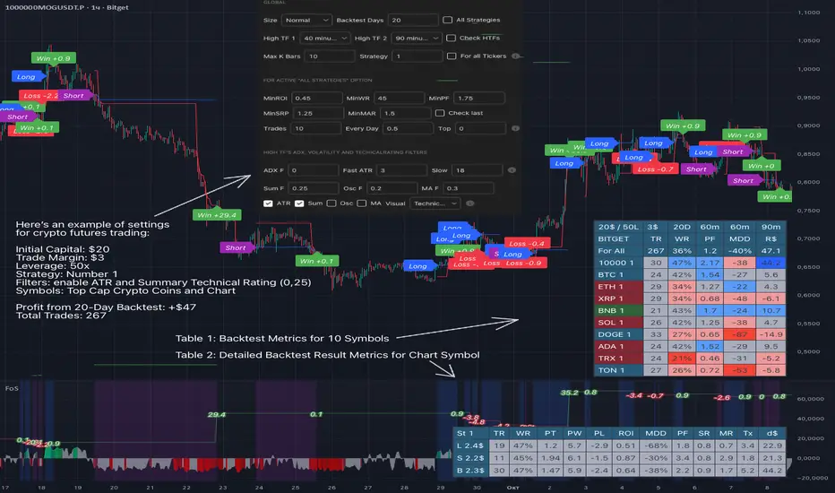
- In the global settings block, as shown in the main chart screenshot, you select how long the script will perform backtests in days, with a limitation on the number of bars for calculations. This limitation is necessary to maintain an acceptable calculation speed. You also choose which two higher timeframes we will use for signal and filters when confirming the opening of trades
- With "All Strategies" off - as in the example on the main chart screenshot, trading is carried out by strategy #1 on 10 selected tickers simultaneously. By default, I selected the 9 top-capitalized cryptocurrencies on the Bitget exchange and the chart symbol. You can change that choice of 9 non chart opened instruments and # strategy for each them
- The first row in the table 1 shows some of the main choosen script settings, in attached example: initial capital 20$, leverage 50L, 20 backtest days, 3$ is invest in one deal, 60m - is chart timeframe, next 60m is higher timeframe 1 and last 90m is higher timeframe 2. In first column you see shortened to 5 characters ticker names
- The exchange name in the second row determines the alert messages format
I've attached another example of trading with setting "All strategies" off in the image below. In this example, trading 10 standard symbols on an hourly timeframe, 2 coins from 10: 1000SATS and DOGE have generated a profit of over $65 over the past 20 days using strategy #4
Can you browse a wide range of trading instruments and select the 10 best strategies and settings for future trading? Of course, trading is what this script is do!
The parameters in the table 1 mean the following:
TR - count of closed trading deals
WR - Winning Rate, PF - Profit Factor
MDD - Max Draw Down for all calculated time from initial capital
R$ - trading profit result in usd
The parameters in the table 2 is just more metrics for chart symbol:
PT - result in usd Per one Trade
PW - result Per Win, PL - result Per Lose
ROI - Rate of Investments
SR - Sharpe Ratio, MR - CalMAR ration
Tx - Commision Fee in Usd
R$ - trading profit result in usd again
Table 2 separate trade results of backtesting for longs and shorts. In first column you see how many USD were invested in one trade, taking into account possible position splitting (will be discussed in more detail in the risk management section)
Settings:
"All Strategies" on, "Check Last" off
When "All Strategies" is active, trading changed from 10 symbols and one strategy to all strategies and one chart symbol. If option "Check Last" is inactive you will see backtest results for each of strategy in backtest setting days. This is useful, for example, if you want to see backtest results under different settings over a long period of time for calibrating risk management or entry rules
"All Strategies" on, "Check Last" on
- If "All Strategies" and "Check Last" is active trading will occur on the chart symbol only for those strategies that meet the criteria of the settings block for the enabled "All Strategies" option. For example your criteria is: for last 5 trades for all strategies, open next trade only on strategy which reached ROI 25% and WinRate 50%. When strategy with this setting criteria receive Buy or Sell Signal this trade will be opened, and when trade will be close "check last" will repeat. This feature i called "Strategy switcher"
-In Table 1 if strategy meet criteria you will see "Ok" label, if strategy meet criteria and have maximum from other reached ROI they labeled "Best". Chart strategy labeled "Chart", Chart and Ok labels in one time is "Chart+", "Chart" and "Best" is labeled "Best+"
- The color in the first column of table 1 indicates that the strategy is currently in an open position: green means an open long position, red means an open short position.
In picture bellow you will see good example for trading with check results for last 10 trades, and make desicion for trading when criteries 0.25 ROI and WinRate 50% reached for Top 2 by ROI strategies from all list of them. This example of trading logic in last 20 days (include periods when strategy don't arise 10 trades) give a profit $30+. At the bottom of the screen, you can see Labels with the numbers of the strategies that opened the trades. In this example, trades were primarily opened using strategy number 2, and the second most effective strategy after the 20-day backtest was strategy number 9
Who can promise you'll make a profit of $30 in the next 20 days with a drawdown of no more than $8 from the initial $20 with invest in one trade just 2.7$? No one. But this script guarantees that in the future it will repeat the same logic of switching trading strategies that brought profit over the last 20 days
Risk management options
- When a buy or sell trade is opened, you'll see three lines on the chart: a red stop-loss line (SL), a green take-profit line (TP), and a blue line representing the entry price. The trade will be closed if the high price or low price reaches the line TP or SL (no wait for bar close) and alert will be triggered once per bar when script recalculates
- Several options are available to control the behavior of SL/TP lines, such as stop-loss by percentage, ATR, or Highest High (HH) and Lowest Low (LL). Take Profit can be in percent, ATR or in Risk Reward ratio. There some Trailing Stop with start trail trigger options, like ATR, percent or HH / LL
- Additionally, in risk managment settings a function has been implemented for adding a position when the breakeven level expressed in the current ROI is reached for opened trade (splitting position). The position is added within the bar.
- Webhook alerts in TTA format with message contained next info : Buy / Sell or adding Quantity, Leverage, SL price, TP price and close trade
Keep in mind if the stop-loss changed when adding a position, the stop-loss will not be able to be higher than the current bar's low price, regardless of your settings, as backtest trades do not use intra-bar data, in this situation SL will be correct at next bar (but alert message don't be sended twice). And please note that this script does not have an option to simultaneously open trades in different directions. Only 1 trade can be opened for 1 trading instrument at a time
Backtest Engine
Backtest is a very important part of this script. Here describe how its calculate:
- Profit or Loss is USD: close trade price * open trade quantity - open trade price * open trade quantity - open trade quantity * (open trade price + close trade price)/2 * commision fee
Possible slippage or alert sending delay needed to be include in commission % which you will set in risk managment settings block, default settings is 0.15% (0,06% for open, 0,06% for close and 0,03% for possible slippage or additional fees)
- Maximum Draw Down: Drawdown = (peak - current equity) / peak * 100 ;
Drawdown > maxDrawdown ? maxDrawdown = Drawdown
- ROI: profit result in USD / sum of all positions margin
- CalMAR Ratio: ROI / (-MaxDrawDown)
- Sharpe Ratio: ROI / standard deviation for (Sum of all Profits and Loses) / (Sum of all Position Margins)
This description was added because in metrics i don't use parameters like "The risk-free rate of return". Keep in mind how exactly this script calculate profit and perfomance when adjusting key criteria in the strategy switching parameters block of script settings
Strategies itself
For trading, you can enable or disable various Higher Timeframes Filters (ADX, volatility, technical rating).
With filters enabled, trades will only open when the setting parameters are reached
- Strategy number 1, 2 and 3: is Higher Timeframe TradingView Technical Ratings itself, 1 is summary total rating, 2 is oscillators and 3 is moving averages. When TR filter cross filter levels trade will be open at chart bar close. By Default on chart you see Summary Technical Rating oscillator, but here the options for change it to Oscillator TR or Moving Average TR
- Strategy number 4, 5 and 6: is Chart TimeFrame TR. Trades will open when its values (Summary, Oscillators and Moving Averages) reached setting buy sell level
- Strategy number 7, 8 and 9: is Alternative buy sell logic for Chart TimeFrame TR, trades will open when counting rising or falling values will be reached
- Strategies with number from 10 to 18: is chosen by user adaptive moving averages and oscillators indicators. There in settings you will see many different adaptive length algorithms for trading and different types of moving averages and oscillators. In tooltips in settings you will find very more information, and in settings you will see list of all indicators and algorithms (more than 30 variations). All adaptive strategies have their options in settings for calibrating and plotting
- Strategies with number from 19: its can't be chosen or calibarted, this is needed for avoid overfitting, i try to found mostly time worked strategies and use its with standard settings. In future it's possible to changing current or adding additional strategies. At the time of publication this script uses: Dynamic Swing HH LL (19), Composite indicator (20), %R Exhausting with different signals (21,22,23), Pivot Point SuperTrend (24), Ichimoku Cloud (25), TSI (26), Fib Level RSI (27). I don't plot classic strategies in this script
Let me explain, the value of this script is not in the strategies it includes, but in how exactly it collects the results of their work, how it filters the opening of trades, what risk management it applies and what strategy switching logic it performs. The system itself that you are now reading about represents the main value of this script
Finally if you get access for this script
- You will see many other not described options and possibilities like Kelly position or list of settings for adaptive strategies, also i added many usefull tooltips in script settings
Happy trading, and stay tuned for updates!
DISCLAIMER: No sharing, copying, reselling, modifying, or any other forms of use are authorized for this script, and the information published with them. This script is strictly for individual use. No one know future and Investments are always made at your own risk. I am not responsible for any losses you may incur. Please before investment make sure that chosen logic is enaugh profitable on virtual demo account.
Position Sizer SimplifiedThis is a Pine Script® indicator for TradingView called "Position Sizer Simplified". Its primary function is to help a trader quickly calculate the appropriate position size for a trade based on their chosen risk tolerance, account size, and the trade's entry/stop-loss levels. The results are displayed neatly in a customizable table on the chart.
This tool is essential for proper risk management in trading.
Core Functionality & Inputs
The script uses a few key inputs to perform its calculations:
Account & Risk Configuration
Account Size: You can define and switch between two account sizes (account_size_1 and account_size_2) using the account_option toggle ("P1" or "P2"). The chosen size determines the total capital.
Risk % per Trade (risk_percent): This is the percentage of your chosen account size that you are willing to lose on a single trade. Example: 0.5% risk on a $180,000 account means you risk $900 per trade.
Trade Parameters
Entry Price, Stop Loss Price, Target Price: These are the manual prices a trader enters for their planned trade.
Reset All Inputs (enable_reset): A toggle to quickly clear the three price inputs by setting them to 0.
🧮 Key Calculations
The script calculates several critical values to determine the position size:
Risk per Trade: The actual dollar amount you are risking:
Account Size×(100Risk %)
Stop Distance: The price difference between the entry and stop-loss:
Entry Price−Stop Loss Price
(This assumes a Long trade; for a Short trade, the calculation would be reversed, but the magnitude must be positive for the next step).
Position Size: The maximum number of shares/contracts you can buy/sell while keeping the dollar risk within your Risk per Trade amount. This is the main output:
Position Size=Floor(Stop DistanceRisk per Trade)
The math.floor() function ensures the position size is a whole number (no fractional shares).
Capital Required: The total cost to open the calculated position:
Position Size×Entry Price
Risk/Reward (R:R) Ratio: The potential reward compared to the risk taken:
Stop DistanceTarget Price−Entry Price
Table Display & Customization
The script's output is displayed in a customizable table on the chart.
Display Toggles
A large section of boolean (input.bool) variables (e.g., show_position_size, show_rr_ratio) allows the user to turn on/off individual rows in the results table, customizing what information is shown.
Visual Settings
Table Position: The user can select one of four corners for the table (Top Right, Bottom Right, Top Left, Bottom Left).
Colors and Size: Extensive inputs are provided to customize the table's background, border, font size, and text colors.
Conditional Coloring
The script uses colors to provide quick visual warnings and checks on key metrics:
Risk % per Trade:
Green/Lime for ≤1.0% (Low Risk)
Orange for >1.0% and ≤2.0% (Medium Risk)
Red for >2.0% (High Risk)
R:R Ratio:
Green/Lime for ≥2 (Good)
Red for <2 (Bad)
Capital Check:
Green if Capital Required ≤ Account Size (Within Limit)
Red if Capital Required > Account Size (Exceeds Account)
Displayed Outputs
The table provides a comprehensive set of calculated metrics, including:
Current Ticker: The symbol of the asset being traded.
Position Size: The calculated share/contract quantity.
Risk per Trade: The dollar amount risked.
Stop Distance (pts/%): How far the stop-loss is from the entry price, in both price points and a percentage of the entry price.
Target Reward ($/%): The potential profit in dollars and as a percentage.
R:R Ratio: The calculated Risk/Reward ratio.
Target 1 (50%): Half the distance to the full target (potential partial take profit).
Target 2 (100%): The full target_price.
Capital Check: A quick status on whether the trade exceeds the total account size.
Summary: A single line detailing the trade direction (Long/Short), prices, size, and R:R ratio.
This indicator is a powerful tool for traders who want to maintain strict, quantifiable risk control on every position they take.

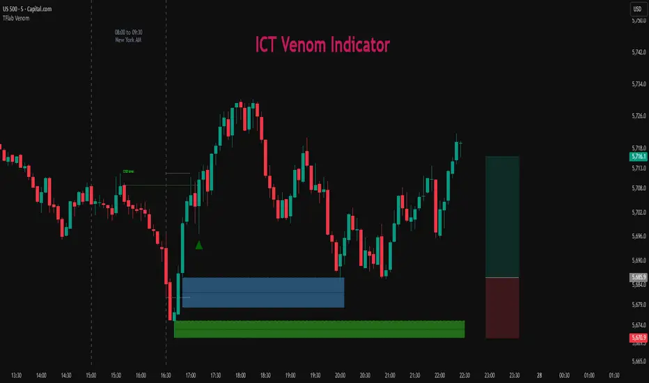
ICT Venom Trading Model [TradingFinder] SMC NY Session 2025SetupIntroduction
The ICT Venom Model is one of the most advanced strategies in the ICT framework, designed for intraday trading on major US indices such as US100, US30, and US500. This model is rooted in liquidity theory, time and price dynamics, and institutional order flow.
The Venom Model focuses on detecting Liquidity Sweeps, identifying Fair Value Gaps (FVG), and analyzing Market Structure Shifts (MSS). By combining these ICT core concepts, traders can filter false breakouts, capture sharp reversals, and align their entries with the real institutional liquidity flow during the New York Session.
Key Highlights of ICT Venom Model :
Intraday focus : Optimized for US indices (US100, US30, US500).
Time element : Critical window is 08:00–09:30 AM (Venom Box).
Liquidity sweep logic : Price grabs liquidity at 09:30 AM open.
Confirmation tools : MSS, CISD, FVG, and Order Blocks.
Dual setups : Works in both Bullish Venom and Bearish Venom conditions.
At its core, the ICT Venom Strategy is a framework that explains how institutional players manipulate liquidity pools by engineering false breakouts around the initial range of the market. Between 08:00 and 09:30 AM New York time, a range called the “Venom Box” is formed.
This range acts as a trap for retail traders, and once the 09:30 AM market open occurs, price usually sweeps either the high or the low of this box to collect stop-loss liquidity. After this liquidity grab, the market often reverses sharply, giving birth to a classic Bullish Venom Setup or Bearish Venom Setup
The Venom Model (ICT Venom Trading Strategy) is not just a pattern recognition tool but a precise institutional trading model based on time, liquidity, and market structure. By understanding the Initial Balance Range, watching for Liquidity Sweeps, and entering trades from FVG zones or Order Blocks, traders can anticipate market reversals with high accuracy. This strategy is widely respected among ICT followers because it offers both risk management discipline and clear entry/exit conditions. In short, the Venom Model transforms liquidity manipulation into actionable trading opportunities.
Bullish Setup :
Bearish Setup :
🔵 How to Use
The ICT Venom Model is applied by observing price behavior during the early hours of the New York session. The first step is to define the Initial Range, also called the Venom Box, which is formed between 08:00 and 09:30 AM EST. This range marks the high and low points where institutional traders often create traps for retail participants. Once the official market opens at 09:30 AM, price usually sweeps either the top or bottom of this box to collect liquidity.
After this liquidity grab, the market tends to reverse in alignment with the true directional bias. To confirm the setup, traders look for signals such as a Market Structure Shift (MSS), Change in State of Delivery (CISD), or the appearance of a Fair Value Gap (FVG). These elements validate the reversal and provide precise levels for trade execution.
🟣 Bullish Setup
In a Bullish Venom Setup, the market first sweeps the low of the Venom Box after 09:30 AM, triggering sell-side liquidity collection. This downward move is often sharp and deceptive, designed to stop out retail long positions and attract new sellers. Once liquidity is taken, the market typically shifts direction, forming an MSS or CISD that signals a reversal to the upside.
Traders then wait for price to retrace into a Fair Value Gap or a demand-side Order Block created during the reversal leg. This retracement offers the ideal entry point for long positions. Stop-loss placement should be just below the liquidity sweep low, while profit targets are set at the Venom Box high and, if momentum continues, at higher session or daily highs.
🟣 Bearish Setup
In a Bearish Venom Setup, the process is similar but reversed. After the Initial Range is defined, if price breaks above the Venom Box high following the 09:30 AM open, it signals a false breakout designed to collect buy-side liquidity. This move usually traps eager buyers and clears out stop-losses above the high.
After the liquidity sweep, confirmation comes through an MSS or CISD pointing to a reversal downward. At this stage, traders anticipate a retracement into a Fair Value Gap or a supply-side Order Block formed during the reversal. Short entries are taken within this zone, with stop-loss positioned just above the liquidity sweep high. The logical profit targets include the Venom Box low and, in stronger bearish momentum, deeper session or daily lows.
🔵 Settings
Refine Order Block : Enables finer adjustments to Order Block levels for more accurate price responses.
Mitigation Level OB : Allows users to set specific reaction points within an Order Block, including: Proximal: Closest level to the current price. 50% OB: Midpoint of the Order Block. Distal: Farthest level from the current price.
FVG Filter : The Judas Swing indicator includes a filter for Fair Value Gap (FVG), allowing different filtering based on FVG width: FVG Filter Type: Can be set to "Very Aggressive," "Aggressive," "Defensive," or "Very Defensive." Higher defensiveness narrows the FVG width, focusing on narrower gaps.
Mitigation Level FVG : Like the Order Block, you can set price reaction levels for FVG with options such as Proximal, 50% OB, and Distal.
CISD : The Bar Back Check option enables traders to specify the number of past candles checked for identifying the CISD Level, enhancing CISD Level accuracy on the chart.
🔵 Conclusion
The ICT Venom Model is more than just a reversal setup; it is a complete intraday trading framework that blends liquidity theory, time precision, and market structure analysis. By focusing on the Initial Range between 08:00 and 09:30 AM New York time and observing how price reacts at the 09:30 AM open, traders can identify liquidity sweeps that reveal institutional intentions.
Whether in a Bullish Venom Setup or a Bearish Venom Setup, the model allows for precise entries through Fair Value Gaps (FVGs) and Order Blocks, while maintaining clear risk management with well-defined stop-loss and target levels.
Ultimately, the ICT Venom Model provides traders with a structured way to filter false moves and align their trades with institutional order flow. Its strength lies in transforming liquidity manipulation into actionable opportunities, giving intraday traders an edge in timing, accuracy, and consistency. For those who master its logic, the Venom Model becomes not only a strategy for entry and exit, but also a deeper framework for understanding how liquidity truly drives price in the New York session.
Altcoins Exit Executor: 3Commas-Integrated [SwissAlgo]Title: Altcoins Exit Executor: 3Commas-Integrated
Plan and Execute your Altcoins Exits via 3Commas Integration
------------------------------------------------------------------
1. Facing These Struggles?
You're holding a portfolio of altcoins, and the question keeps nagging you: when should you exit? how?
If you're like many crypto traders, you might recognize these familiar struggles:
The Planning Problem : You know you should have an exit strategy, but every time you sit down to plan it, you get overwhelmed. Should you sell at 2x? 5x? What about that resistance level you spotted last month? You end up postponing the decision again and again.
The Execution Headache : You use 3Commas (or an Exchange directly) for your trades, but setting up Smart Trades for multiple coins means endless manual data entry. Price levels, percentages, quantities - by the time you finish entering everything, the market may have already moved.
The Portfolio Scale Problem : Managing 5 altcoins is challenging enough, but what about 15? Or 30? The complexity grows exponentially with each additional position. What started as a manageable analysis for a few coins becomes an overwhelming juggling act that may lead to rushed decisions or complete paralysis.
The Consistency Challenge : You approach each coin differently. Maybe you're conservative with one position and aggressive with another, without any systematic reasoning. Your portfolio becomes a patchwork of random decisions rather than a coherent strategy. With dozens of positions, maintaining any consistent approach becomes nearly impossible.
The "What If" Anxiety : What happens if the market crashes while you're sleeping? You know you should have stop-losses, but setting them up properly across multiple positions feels overwhelming. The more coins you hold, the more potential failure points you need to monitor.
The Information Overload : You collect multiple data points, but how do you synthesize all this information into actionable exit points? Multiply this analysis across 20+ different altcoins, and the task becomes nearly impossible to execute consistently.
This indicator may help address these challenges by providing you with:
A systematic approach to analyzing potential resistance levels across multiple technical frameworks. All potential resistances (including Fibonacci levels) are calculated automatically
Tools to structure your exit plan with clear take-profit levels and position sizing
Automated generation of 3Commas 'Smart Trades' that match your exit strategy exactly, without manual entry
Optional emergency exit protection that could potentially guard against sudden market reversals (exit managed within the 3Commas 'Smart Trade' itself)
A consistent methodology you can apply across your entire altcoin portfolio, regardless of size
The goal is to transform exit planning from a source of stress and procrastination into a structured, repeatable process that may help you execute your trading plan in a consistent fashion, whether you're managing 3 coins or 30.
------------------------------------------------------------------
2. Is this for You?
This indicator is designed for cryptocurrency traders who:
Hold a portfolio of multiple altcoins (typically 5+ positions)
Are actively seeking a systematic solution to plan and execute exit strategies
Have an active 3Commas account connected to their exchange
Understand 3Commas basics: Smart Trades, API connections, and account management
Have an account tier that supports their portfolio size (3Commas Free Plan: up to 3 trades/alts, Pro Plan: up to 50+ trades/alts)
Important: This tool provides analysis and automation assistance, not trading advice. All exit decisions require your individual judgment and proper risk management.
If you don't use 3Commas, you may still find value in the resistance analysis components, though the automated execution features require a 3Commas account and basic platform knowledge.
------------------------------------------------------------------
3. How does it work?
This indicator streamlines your exit planning process into four steps:
Step 1: Analyze Your Coin & Define Exit Plan
The indicator automatically calculates multiple types of resistance levels that may act as potential exit points:
Fibonacci Extensions (projected resistance from recent price swings)
Fibonacci Retracements (resistance from previous cycle highs)
Major Pivot Highs (historical price rejection points)
Volume Imbalances (PVSRA analysis showing institutional activity zones)
Price Multipliers (2x, 3x, 4x, 5x psychological levels)
Market Trend Analysis (bull/bear market strength assessment)
You can view all resistance types together or focus on specific categories to identify potential exit zones.
Step 2: Enter Your Exit Plan.
Define your sequential take-profit strategy:
Set up to 5 take-profit levels with specific prices
Assign percentage of coins to sell at each level
Add your total coin quantity and average entry price
Optionally enable emergency exit (stop-loss) protection. The indicator validates your plan in real-time, ensuring percentages sum to 100% and prices follow logical sequences.
Step 3: Connect with 3Commas
Relay Secret
3Commas API keys (Public and Private)
Account ID (your exchange account on 3Commas)
Step 4: Generate Smart Trade on 3Commas
Create a TradingView alert that automatically:
Sends your complete exit plan to 3Commas
Creates a Smart Trade with all your take-profit levels
Includes stop-loss protection if enabled
Requires no manual data entry on the 3Commas platform
The entire process is designed to streamline the time required to move from analysis to execution, providing a standardized methodology across your altcoin positions.
User Experience Features:
Step-by-step guided workflow
Interactive submission helper with status tracking
Exit plan table with detailed projections
Comprehensive legend and educational tooltips
Dark/light theme compatibility
Organized visual presentation of all resistance levels
------------------------------------------------------------------
4. Using the Indicator
Complete the 4-step guided workflow within the indicator to set up an Exit Plan and submit it to 3Commas.
At the end of the process, you will see a Smart Trade created on 3Commas reflecting your custom Exit Plan (inclusive of Stop Loss, if enabled).
Recommended Settings
Analyze your Exit Plan on the 1-Day timeframe
Use the Tradingview's Dark-Theme for high visual contrast
Set candles to 'Bar-Type' to view volumr-based candle colors (PVSRA analysis)
Use desktop for full content visibility
Analyzing Resistance Levels
Enable "Show all Resistance Levels" to view comprehensive analysis across your chart
Focus on resistance clusters where multiple resistance seem to converge - these may indicate stronger potential exit zones
Note the color-coded system: gray lines indicate closer levels, red lines suggest stronger resistance or potentially "out-of-reach" targets
Pay attention to the Golden Zone (Fibonacci 0.618-0.786 area) highlighted in green, it might act as a significant price magnet for average altcoins
Decide how many Take Profit Steps to use (min. 1 - max- 5)
Setting up your Plan
Enter the total number of coins you want to sell with the script
Enter your average entry price, if known (otherwise the script will use the current price as backup)
Enter the TP levels you decided to activate (price, qty to sell at each TP level)
Decide about the Emergency Exit (the price that, when broken, will trigger the sale of 100% of your coins with a close limit order)
Setting Up Your 3Commas Connection
Generate API keys in your 3Commas account with (User Profile→3Commas API→New API Access Token→System Generated→Permission: "Smart Trades Only" (leave all other permissions unchecked) + Whitelisted IP→Create→Save API public/private key securely)
Find your Account ID in the 3Commas exchange URL (My Portfolio→View Exchange→Look at the last number in the url of the webpage - should be a 8-digit number)
Enter all credentials in the indicator's connection section
Verify the green checkmarks appear on the Exit Table, confirming that plan and connection are validated
Deploying Your Plan
Check box "Step 1: Check and confirm Exit Plan" in section 4 of User Settings
Create a TradingView alert (Alert→Select Altcoins Exit Planner PRO→Any alert() function call→Interval Same as Chart→Open Ended→Message: coin name→Notifications: enable Webhook→save and exit
Your Smart Trade appears automatically in 3Commas within minutes
IMPORTANT: Delete the alert after successful deployment to prevent duplicated Smart Trades
To modify the Exit Plan: Delete the Smart Trade on 3Commas and repeat the process above
Monitor your Smart Trade execution through your 3Commas dashboard
Important Notes
Always verify your plan in the Exit Table before deployment
Test with smaller positions initially to familiarize yourself with the process
The indicator provides analysis - final trading decisions remain yours
Manage your API keys and Relay secret with caution: do not share with third parties, store them securely, use malware protection on your PC
Your API keys, trading data, and credentials are transmitted securely through direct API connections and are never stored, logged, or accessible to the indicator author - all communication occurs directly between your browser and the target platforms that support the service.
------------------------------------------------------------------
5. Understanding the Resistance Analysis
Fibonacci Extensions: Calculated from three key points: 2022 bear market bottom → early 2024 bull market high → 2025 retracement low. These project where price might encounter resistance during future rallies based on mathematical ratios (0.618, 1.0, 1.618, 2.0, etc.).
Fibonacci Retracements: For established altcoins: calculated from 2021 cycle peak to 2022 bottom. For newer altcoins: from all-time high to subsequent major low. These show potential resistance zones where price may struggle to reclaim previous highs.
Major Pivot Highs: Historical price levels where significant reversals occurred. These act as potential resistance because traders may remember these levels and place sell orders near them.
Volume Imbalances (PVSRA) : Areas where price moved rapidly on abnormal volume, creating gaps that may attract future price action or orders. The indicator uses volume-to-price-range analysis (PVSRA candles or "Vector Candles") to identify these zones.
Price Multipliers: Reference lines showing 2x, 3x, 4x, 5x current price to help you assess the feasibility of your exit targets. These serve as a "reality check" - if you're setting a take-profit at 4x current price, you can quickly evaluate whether that level seems reasonable given current market conditions and your risk tolerance.
Market Trend Analysis: Uses EMA combined with ADX/DMI indicators to assess current market phase (bull/strong bull, bear/strong/bear, weakening trend)
This technical foundation helps explain why certain price levels appear as potential exit zones, though market conditions ultimately determine actual price behavior.
------------------------------------------------------------------
6. FAQs
GENERAL FAQS
Can I use one indicator for multiple altcoins?
Answer: No, each altcoin needs its own chart layout with a separate indicator installation. Resistance levels are calculated from each coin's unique price history, and your exit plan will be different for each position. When you deploy an alert, it creates one Smart Trade on 3Commas for that specific coin only.
To manage multiple coins, create separate TradingView layouts for each altcoin, configure the indicator individually on each chart, then deploy one alert per coin when ready to execute. This ensures each position gets personalized analysis and allows different exit strategies across your portfolio.
EXIT PLAN ANALYSIS/RESISTANCE LEVELS
Are resistance lines calculated automatically by the script?
Answer: Yes, all resistance lines are calculated automatically based on your coin's price history and market data. You don't need to manually identify or draw any levels. The script analyzes historical pivots, calculates Fibonacci ratios from key price swings, identifies volume imbalance zones, and plots everything on your chart.
Simply enable "Show all Resistance Levels" in the settings and the indicator will display all potential resistance zones with color-coded lines and labels showing the exact price levels and their significance.
What's the difference between Fibonacci Extensions and Fibonacci Retracements?
Answer: Fibonacci Retracements look at completed moves from the past and show where price might struggle to reclaim previous highs. For established coins, they're calculated from 2021 peaks down to 2022 bottoms.
Fibonacci Extensions project forward from recent price swings to estimate where ongoing rallies might encounter resistance. They use three points: 2022 bottom, 2024 high, and 2025 retracement low.
Retracements ask "where might recovery stall based on old highs" while Extensions ask "where might this current rally run into trouble." Both use the same mathematical ratios but different reference points to give you complementary resistance perspectives.
Why are some resistance lines gray and others red?
Answer: The color coding helps you assess the potential difficulty of reaching different resistance levels. Gray lines represent closer resistance levels, while red lines indicate stronger resistance or potentially "out-of-reach" targets that may require exceptional market conditions to break through.
This visual system helps you prioritize your exit planning by distinguishing between near-term targets and more ambitious longer-term objectives when setting your take-profit levels.
What is the resistance from major pivot highs?
Answer: Major pivot highs are historical price levels where significant reversals occurred in the past. These levels often act as resistance because traders remember these previous "ceiling" points where price failed to break higher and may place sell orders near them again.
The indicator automatically identifies these pivot points from your coin's price history and draws horizontal lines at those levels. When price approaches these areas again, it may struggle to break through due to psychological resistance and clustered sell orders from traders who expect similar rejection patterns.
What is the resistance from abnormal volumes?
Answer: Volume imbalances occur when price moves rapidly on abnormally high volume, creating gaps or zones where institutions moved large amounts quickly. These areas often act as resistance when price returns to them because institutional traders may want to "fill" these gaps or add to their positions at those levels.
The indicator uses PVSRA analysis to identify candles with abnormal volume-to-price ratios and marks these zones on your chart. When price approaches these imbalance areas again, it may encounter resistance from institutional activity or algorithmic trading systems programmed to react at these levels.
What are price multipliers?
Answer: Price multipliers are reference lines showing 2x, 3x, 4x, and 5x the current price. They serve as a reality check when setting your take-profit targets. If you're considering a take-profit at $10 and current price is $2, you can quickly see that's a 5x target and evaluate whether that seems realistic given current market conditions.
These lines help you assess the feasibility of your exit goals and avoid setting unrealistic expectations. They're not resistance levels themselves, but visual aids to help you gauge whether your planned targets are conservative, aggressive, or somewhere in between
How is the EMA calculated and why does it represent bull/bear market intensity?
Answer: The indicator uses a 147-period EMA (1D tf) combined with ADX and DMI indicators to assess market phases. The EMA provides the basic trend direction - when price is above the EMA, it suggests bullish conditions, and when below, bearish conditions.
The intensity comes from the ADX/DMI analysis. Strong bull markets occur when price is above the EMA, ADX is above 25 (indicating strong trend), and the positive directional indicator dominates. Strong bear markets show the opposite pattern with negative directional movement dominating.
The system also uses weekly ADX slope to confirm trend strength is increasing rather than fading. This combination helps distinguish between weak sideways markets and genuine strong trending phases, giving you context at the time of exit planning.
EXIT PLAN
Why does my exit plan show errors?
Answer: The indicator validates your plan in real-time and shows specific error messages to help you fix issues. Common problems include take-profit percentages that don't sum to exactly 100%, price levels set in wrong order (TP2 must be higher than TP1), or gaps in your sequence (you can't use TP3 without filling TP1 and TP2 first).
Check the Exit Plan Validation section in the table - it will show exactly what needs fixing with messages like "TP percentages must sum to exactly 100%" or "Fill TPs consecutively starting from TP1." Fix the highlighted issue and the error will clear automatically, turning your validation checkmark green when everything is correct.
Why do I need to provide my coin quantity and average entry price?
Answer: The coin quantity is essential because the indicator calculates exact amounts to sell at each take-profit level based on your percentages. If you set TP1 to sell 25% of your position, the script needs to know your total quantity to calculate that 25% means exactly X coins in your 3Commas Smart Trade.
The average entry price helps calculate your projected gains and portfolio performance in the Exit Table. If you don't know your exact entry price, leave it at zero and the indicator will use current price as a fallback for calculations. Both pieces of information ensure your Smart Trade matches your actual position size and gives you accurate profit projections.
What is the emergency exit price?
Answer: The emergency exit price is an optional stop-loss feature that automatically sells 100% of your coin position if price falls to your specified level. This is critical to understand because once triggered, 3Commas will execute the sale immediately without further confirmation.
When price hits your emergency exit level, 3Commas places a limit sell order at 3% below that price to avoid poor market execution. However, execution is not guaranteed because limit orders may not fill during extreme volatility or if price gaps below your limit level. Use this feature cautiously and set the emergency price well below normal support levels to account for typical market fluctuations.
This sells your entire position regardless of your take-profit plan, so only enable it if you want automated crash protection and understand the risks of potential false breakdowns triggering unnecessary exits.
3COMMAS CONNECTION
How do I get my 3Commas API keys and Account ID?
Answer:
For API Keys: Log into 3Commas, go to User Profile → 3Commas API → New API Access Token → System Generated. Set permissions to "Smart Trades Only" (leave all other permissions unchecked) and add your IP to the whitelist for security. Save both the public and private keys securely after creation.
For Account ID: Go to My Portfolio → View Exchange in 3Commas. Look at the URL in your browser - the Account ID is the 8-digit number at the end of the webpage address (example: if the URL shows "/accounts/12345678" then your Account ID is 12345678).
Important: Never share these credentials with anyone. The indicator transmits them directly to 3Commas through secure API connections without storing or logging them. If you suspect your keys are compromised, revoke them immediately in your 3Commas account and generate new ones.
ALERTS
I have set up my exit plan, what's next?
Answer: Once your exit plan is configured and shows green checkmarks in the validation section, follow the 4-step workflow in the indicator. Check "Step 1: Check and confirm Exit Plan" to enable alert firing, then create a TradingView alert using the Altcoins Exit Planner PRO condition with "Any alert() function call" trigger.
The alert fires immediately and sends your plan to 3Commas. Within minutes, you should see a new Smart Trade appear in your 3Commas dashboard matching your exact exit strategy. After confirming the Smart Trade was created successfully, delete the TradingView alert to prevent duplicate submissions.
From that point, 3Commas manages your exit automatically according to your plan. Monitor execution through your 3Commas dashboard and let the platform handle the sequential take-profit levels as price moves.
How do I create the TradingView alert?
Answer: Click the "Alert" button in TradingView (bell icon in the top toolbar). In the alert setup window, set Condition to "Altcoins Exit Planner PRO" and Trigger to "Any alert() function call." Keep Interval as "Same as Chart" and Expiration as "Open Ended."
In the Message section, you can name your alert anything you want. In the Notifications section, enable the webhook option (leave the URL field as you'll handle that separately). You can also enable email or sound notifications if desired.
Click "Create" to activate the alert. If Step 1 is already checked in your indicator, the alert will fire immediately and send your exit plan to 3Commas. Remember to delete this alert after your Smart Trade appears to prevent duplicates.
I got the Smart Trade on 3Commas, what's next?
Answer: Congratulations! Your exit plan is now active and automated. Delete the TradingView alert immediately to prevent duplicate Smart Trades from being created. You can now monitor your Smart Trade's progress through your 3Commas dashboard.
3Commas will automatically execute your take-profit levels as price reaches each target, selling the specified percentages of your position according to your plan. If you enabled emergency exit protection, that stop-loss is also active and monitoring for downside protection.
Your job is essentially done - let 3Commas handle the execution while you monitor overall market conditions. You can view trade progress, modify the Smart Trade if needed, or manually close it early through your 3Commas interface. The platform will manage all the sequential selling according to your original exit strategy.
Can I cancel my exit plan and resubmit to 3Commas?
Answer: Yes, you can modify your exit strategy by first deleting the existing Smart Trade in your 3Commas dashboard, then resubmitting a new plan through the indicator.
To cancel and resubmit: Go to your 3Commas Smart Trades section and delete the current trade. Return to the TradingView indicator, modify your exit plan settings (prices, percentages, emergency exit, etc.), then repeat the deployment process by checking Step 1 and creating a new alert.
This creates a fresh Smart Trade with your updated parameters. Always ensure you delete the old Smart Trade first to avoid having multiple conflicting exit plans running simultaneously. The new deployment will overwrite nothing automatically - you must manually clean up the old trade before submitting the revised plan.
Why did I get a second Smart Trade after the first one?
Answer: This happens when you forget to delete the TradingView alert after your first Smart Trade was created successfully. The alert remains active and continues firing, creating duplicate Smart Trades each time it triggers.
Always delete your TradingView alert immediately after confirming your Smart Trade appears in 3Commas. Go to your TradingView alerts list, find the alert you created for this exit plan, and delete it completely. Also delete any duplicate Smart Trades in your 3Commas dashboard to avoid confusion.
To prevent this in future deployments, remember the workflow: create alert → Smart Trade appears → delete alert immediately. Each exit plan should only generate one Smart Trade, and keeping alerts active will cause unwanted duplicates.
------------------------------------------------------------------
7. Limitations and Disclaimer
Limitations:
Doesn't provide trading signals or entry points
Doesn't guarantee resistance levels will hold
Requires manual monitoring of 3Commas execution
Works for exit planning only, not position building
Disclaimer
This indicator is for educational and informational purposes only. It does not constitute financial, investment, or trading advice.
The indicator:
Makes no guarantees about future market performance
Cannot predict market movements with certainty
May generate false indications
Relies on historical patterns that may not repeat
Should not be used as the sole basis for trading decisions
Users are responsible for:
Conducting independent research and analysis
Understanding the risks of cryptocurrency trading
Making their own investment/divestment decisions
Managing position sizes and risk exposure appropriately
Managing API keys and secret codes diligently (do not share with third parties, store them securely, use malware protection on your PC)
Cryptocurrency trading involves substantial risk and may not be suitable for all investors. Past performance does not guarantee future results. Users should only invest what they can afford to lose and consult qualified professionals before making financial decisions.
The indicator’s assumptions may be invalidated by changing market conditions.
By using this tool, users acknowledge these limitations and accept full responsibility for their trading decisions.

Alpha VolumeThis script is a comprehensive trading toolkit designed to integrate position sizing, risk management, and key data metrics directly onto your chart. It goes beyond a simple volume indicator by providing two interactive tables and a special volume signal to aid in trade planning and analysis.
What It Does
The "Alpha Volume" indicator is a multi-functional tool that helps traders make more informed decisions. Its core components are:
- A Position Size Calculator that dynamically determines how many shares to trade based on your account size, risk tolerance, and different stop-loss strategies.
- A Data Metrics Table that displays essential fundamental information like Market Cap, Industry, Sector, and Float shares.
- An Episodic Pivot (EP) signal that highlights bars with exceptionally high volume, pinpointing potentially significant market events.
Key Features
Dynamic Position Sizing: Automatically calculates the ideal trade size based on various stop-loss points:
- The low or high of the day.
- The midpoint of the current candle.
- Three customizable fixed percentage stop-losses (e.g., 0.75%, 1.00%, 1.25%).
Interactive Risk Management: After you enter a trade, you can input your actual entry price and quantity. The script will then calculate:
- The exact stop-loss price required to meet your predefined risk.
- The distance to your stop-loss in both percentage and currency.
- Up to 10 R-Multiple price targets to help with profit-taking.
On-Chart Fundamental Data: The Data Metrics table provides a quick snapshot of the company's financial health and classification, saving you from switching between screens.
- Episodic Pivot Signal: A simple triangle appears below a daily candle when its volume surpasses a user-defined threshold (e.g., 9 million shares), drawing your attention to stocks under significant accumulation or distribution.
How to Use
Pre-Trade Planning:
- In the indicator settings, enter your Capital and define your Risk per trade (either as a percentage like 0.5% or a fixed currency amount like $5000).
- The "Position Size Table" will instantly show you the quantity you can trade based on different potential stop-loss levels. For example, Q shows the quantity if your stop is the day's low, and SQ shows quantities for fixed percentage stops.
Trade Execution & Management:
- Once you're in a trade, enter your Position Opened (PO) price and Quantity Actual (QA) in the settings.
- The second table will update to show your calculated stop-loss (PC), the distance to it (DA), and your R-Multiple targets (RM), giving you a clear plan for managing the trade.
Market Analysis:
- Use the Episodic Pivot signal on the daily chart to identify stocks experiencing unusual volume, which often precedes significant price moves.
- Glance at the Data Metrics Table to quickly understand the company's size (Market Cap) and business (Industry/Sector).

ICT Turtle Soup (Riz)The ICT Turtle Soup Complete System is an advanced implementation of the Inner Circle Trader's interpretation of the classic Turtle Soup pattern, designed to identify and trade liquidity sweeps at key market levels. This strategy capitalizes on the systematic stop-loss hunting behavior of institutional traders by detecting when price temporarily breaches significant support/resistance levels to trigger retail stop-losses, then quickly reverses direction.
Core Trading Logic
Liquidity Sweep Detection Method
The strategy monitors five critical liquidity pools where retail traders commonly place stop-loss orders:
⦁ Yesterday's High/Low: Previous daily session extremes
⦁ Daily High/Low: Rolling 20-day period extremes
⦁ 4-Hour High/Low: 30-period extremes on 4H timeframe
⦁ 1-Hour High/Low: 50-period extremes on hourly timeframe
⦁ Recent High/Low: Current timeframe extremes (20-40 bars based on trading mode)
Entry Signal Generation Process
Buy Signal (Sell-Side Liquidity Sweep):
1. Price penetrates below a key support level by a minimum threshold (5-15 ticks depending on signal quality settings)
2. The penetration bar must show strong rejection with at least 30-50% of the candle's range closing back above the swept level
3. Multi-timeframe confirmation checks for structure shift on lower timeframe (break of recent swing high)
4. Confluence scoring system evaluates 7 factors, requiring minimum 3 confirmations:
⦁ Liquidity sweep detected (weighted 2x)
⦁ Higher timeframe bullish market structure
⦁ Lower timeframe bullish break of structure
⦁ Bullish Fair Value Gap presence
⦁ Bullish Order Block formation
⦁ ICT Kill Zone timing alignment
Sell Signal (Buy-Side Liquidity Sweep):
Mirror opposite of buy signal logic, detecting sweeps above resistance levels with bearish rejection.
Risk Management & Position Sizing
Stop Loss Placement:
⦁ Calculated using ATR (Average True Range) multiplied by an adaptive factor
⦁ Base multipliers: Scalping (1.0x), Day Trading (1.5x), Swing Trading (2.0x)
⦁ Further adjusted by signal quality: Conservative (-20%), Balanced (0%), Aggressive (+20%)
⦁ Positioned beyond the liquidity sweep point to avoid re-sweeping
Take Profit Targets:
⦁ TP1: 2.0R (Risk-Reward ratio)
⦁ TP2: 3.5R
⦁ TP3: 5.0R
⦁ All levels rounded to tick precision for accurate order placement
Advanced Features & Filters
Multi-Timeframe Structure Analysis
The system performs top-down analysis across three timeframes:
⦁ Higher Timeframe (HTF): Determines primary trend bias
⦁ Medium Timeframe (MTF): Confirms intermediate structure
⦁ Lower Timeframe (LTF): Identifies precise entry triggers
ICT Kill Zones
Incorporates time-based filtering for optimal trading sessions:
⦁ Asian Session (8PM-12AM UTC)
⦁ London Session (2AM-5AM UTC)
⦁ New York Session (7AM-10AM UTC)
⦁ London Close (10AM-12PM UTC)
Smart Money Concepts Integration
⦁ Fair Value Gaps (FVG): Identifies and displays price inefficiencies that act as magnets
⦁ Order Blocks: Marks institutional accumulation/distribution zones
⦁ Mitigation Detection: Automatically removes FVGs and Order Blocks when price fills them
⦁ Duplicate Sweep Prevention: 10-bar lookback prevents multiple signals at same level
Adaptive Trading Modes
Three pre-configured modes automatically adjust all parameters:
⦁ Scalping: Tight stops, quick targets, 15-minute to 1-hour focus
⦁ Day Trading: Balanced approach, 4-hour to daily analysis
⦁ Swing Trading: Wide stops, extended targets, daily to weekly perspective
⦁ Custom Mode: Full manual control of all parameters
Signal Quality Management
⦁ Conservative: Requires 5/7 confluence factors, tighter sweep threshold (5 ticks), 50% minimum rejection
⦁ Balanced: Standard 3/7 confluence, moderate threshold (10 ticks), 30% rejection
⦁ Aggressive: Only 2/7 confluence needed, wider threshold (15 ticks), 20% rejection
Visual Components & Dashboard
Real-Time Information Panel
Displays current market conditions including:
⦁ Active trading mode and quality settings
⦁ Timeframe configuration (HTF/MTF/LTF)
⦁ Market bias from higher timeframes
⦁ Current kill zone status
⦁ Liquidity sweep detection status
⦁ Confluence scoring for both directions
⦁ Risk parameters and targets
Trade Visualization
⦁ Entry, stop-loss, and three take-profit levels with precise price labels
⦁ Automatic cleanup when targets are hit or new signals appear
⦁ Maximum of one active setup displayed for chart clarity
⦁ Color-coded boxes for Fair Value Gaps and Order Blocks
How to Use This Indicator
Recommended Timeframes
⦁ Scalping Mode: 1-minute to 5-minute charts
⦁ Day Trading Mode: 5-minute to 15-minute charts
⦁ Swing Trading Mode: 1-hour to 4-hour charts
Optimal Market Conditions
⦁ Works best in ranging or trending markets with clear support/resistance levels
⦁ Most effective during high-liquidity sessions (London/New York overlap)
⦁ Avoid using during major news events unless specifically targeting news-driven sweeps
Signal Interpretation
1. Wait for triangle signal (up/down) with confluence score
2. Verify the swept level shown in the dashboard
3. Confirm risk-reward ratios match your trading plan
4. Enter at market or set limit order at indicated entry level
5. Place stop-loss and take-profit orders at displayed levels
Customization Tips
⦁ Adjust Signal Quality based on market volatility (Conservative for volatile, Aggressive for quiet)
⦁ Modify sweep threshold if getting too many/few signals
⦁ Toggle individual liquidity levels based on their relevance to your timeframe
⦁ Use Kill Zone filter for session-specific trading
Risk Disclaimer
This indicator identifies potential trade setups based on liquidity sweep patterns but does not guarantee profitable outcomes. Past performance does not indicate future results. Always use proper risk management and never risk more than you can afford to lose. The indicator should be used as part of a comprehensive trading plan that includes your own analysis and risk tolerance assessment.

Stocker++Stocker++ Trading Indicator: Complete User Guide
This comprehensive trading indicator combines technical analysis, fundamental analysis, risk management, and value investing principles into an integrated decision-making system. Here's how to use it effectively for investment decisions.
Core Functionality Overview
The indicator provides six customizable data tables that display on your chart, each serving a specific analytical purpose. You can enable/disable individual tables and adjust their positions, colors, and text sizes to suit your preferences.
Table 1: Risk Management and Volume Analysis
Risk Management Section
This table calculates your optimal position size based on your account size and risk tolerance. Key components include:
Account Size and Risk Parameters: Enter your total trading capital and the percentage you're willing to risk per trade (typically 1-2%). The indicator automatically calculates the dollar amount at risk.
Stop Loss Calculation: Choose between two methods - ATR-based (Average True Range) or Low of Day. The ATR method provides a volatility-adjusted stop loss, while LoD uses the day's low as support.
Position Sizing: The indicator calculates exactly how many shares to buy based on your risk parameters and stop loss distance. It also shows your total position size as both a dollar amount and percentage of your account.
Liquidity Analysis: Critical safety features include:
Maximum allowed position based on daily volume (prevents you from taking positions too large for the stock's liquidity)
Minimum required daily volume for your position size
Liquidity ratio showing if there's sufficient volume for your trades
Float analysis indicating what percentage of shares are publicly tradeable
Position impact assessment showing how your trade might affect the stock price
Volume Analysis Section
Provides real-time liquidity metrics:
Average daily dollar volume (20-day average)
Average daily share volume
Relative volume (current vs average)
Volume buzz (unusual activity indicator)
Table 2: Company Information and Analyst Ratings
Company Metrics
Displays essential market data:
Daily price change in dollars
ATR (14-day volatility measure)
Average Daily Range percentage
Low of Day price and distance from current price
Market capitalization
Total shares outstanding
Float shares and percentage
Free cash flow and yield
Employee count and shareholder numbers
Sector and industry classification
Gap analysis (today's low vs yesterday's high)
Analyst Recommendations
Shows consensus analyst opinions:
Number of buy, strong buy, sell, strong sell, and hold ratings
Total analyst coverage
Date of most recent recommendations
Table 3: Earnings History
Displays quarterly earnings performance across multiple periods:
Standardized EPS (adjusted for one-time items)
Reported EPS
Analyst estimates
Earnings surprise (beat/miss) with percentages
Revenue actuals vs estimates
Revenue surprise percentages
Color coding: Green for beats, red for misses
Table 4: Comprehensive Financial Analysis
Income Statement Metrics
Quarterly revenue with gross profit margins
Operating income and margins
Net income and profit margins
Earnings per share
Balance Sheet Analysis
Total assets, liabilities, and equity
Cash and equivalents
Total debt
Debt-to-equity ratio (risk indicator)
Valuation Metrics
Market cap and enterprise value
EV/Revenue ratio
Price-to-book ratio
Book value per share
Return on Equity (ROE)
Return on Assets (ROA)
Key Multipliers
P/E ratio (Price to Earnings)
P/S ratio (Price to Sales)
PEG ratio (P/E to Growth)
EV/EBITDA
Advanced Valuation Analysis
The indicator calculates fair value using multiple methodologies:
Graham Number for profitable companies
DCF (Discounted Cash Flow) model
Revenue-based valuation for unprofitable companies
Asset-based valuation for pre-revenue companies
It provides:
Fair value estimate with methodology used
Current price vs fair value percentage
Investment rating (0-10 scale)
Long-term outlook assessment
Warren Buffett Criteria Section
Evaluates stocks against Buffett's investment principles:
ROE Quality (must exceed 15%)
Debt Payoff Time (should be under 3 years)
Economic Moat score (competitive advantages)
Owner Earnings (Buffett's preferred cash flow metric)
Margin of Safety (discount to intrinsic value)
Overall Buffett Score (0-5 scale)
Table 5: Investment Summary Dashboard
This synthesizes all analysis into actionable insights:
Investment Grade: Letter grade (A-F) based on weighted scoring of liquidity, cash flow, valuation, and Buffett criteria
Decision Output: Clear BUY, HOLD, or AVOID recommendation
Risk Assessment: Categorizes overall risk as minimal, low, moderate, or high
Key Summary Metrics:
Valuation status with margin of safety percentage
Buffett score and verdict
Liquidity quality and float percentage
Cash flow quality and FCF yield
Risk alerts for critical issues
Investment Strategy Framework
Entry Criteria
For a BUY signal, the indicator requires:
Investment score ≥7 out of 10
Margin of safety >25% (stock trading below fair value)
Float percentage >20% (configurable)
FCF margin >5% or cash runway >2 years
Buffett score ≥3 out of 5
Position Sizing Strategy
Set your account size and risk percentage (1-2% recommended)
The indicator calculates optimal share count based on stop loss distance
Verify the position doesn't exceed liquidity constraints
Check position impact - should be <0.1% of float for minimal market impact
Risk Management Rules
Use the calculated stop loss level (ATR or LoD based)
Ensure position size doesn't exceed 30% of account (or the calculated maximum)
Verify average daily volume is at least 200x your position size
Monitor the liquidity ratio - should be >2x for safe entry/exit
Fundamental Quality Checks
Before investing, ensure:
Positive or improving margins (gross, operating, net)
Debt-to-equity ratio <2 (preferably <1)
Positive free cash flow or adequate cash runway
ROE >15% for established companies
Revenue growth and earnings consistency
Exit Considerations
Consider selling when:
Stock reaches fair value (margin of safety approaches 0%)
Fundamental metrics deteriorate significantly
Debt levels become concerning (D/E >2)
Free cash flow turns negative without clear path to profitability
Technical indicators (moving averages) show breakdown
Moving Averages Component
The indicator includes six customizable moving averages (SMA or EMA) with individual:
Period lengths (default: 10, 20, 50, 100, 150, 200)
Timeframes (can use higher timeframes on lower charts)
Colors for visual distinction
Use these for trend identification and support/resistance levels.
Practical Usage Tips
For Growth Investors: Focus on revenue growth, improving margins, and moderate valuation with emphasis on long-term outlook
For Value Investors: Prioritize margin of safety >25%, Buffett score ≥4, and fundamental strength
For Traders: Use volume analysis, technical levels, and strict position sizing with stop losses
For Risk-Averse Investors: Only consider stocks with investment grade A or B, minimal risk assessment, and strong cash positions
Warning Indicators
The system highlights critical risks:
Low float (<20%) - high volatility risk
Cash burn with <2 years runway
Overvaluation >150% of fair value
High debt (D/E >2)
Insufficient liquidity for position size

Ultimate📖 Indicator Description – Ultimate
The Ultimate Indicator is a complete charting framework that combines linear regression channels, dynamic deviation bands, EMA ribbons, volatility spreads, and entry/exit markers. It is designed to help traders visualize trend direction, potential reversals, and trade setups with precision.
🔹 What You See on the Chart
Channel Lines (Linear Regression Bands)
Green dotted line (median): Fair value trendline based on regression.
Red dashed line (upper band): Dynamic resistance zone.
Blue dashed line (lower band): Dynamic support zone.
Mid-bands (thin dotted red/blue): Halfway between median and outer bands, useful for scaling entries or partial exits.
🔹 EMA Ribbon (Light Green Shades)
Multiple EMAs (5, 8, 13, 21, 34) plotted in progressively lighter green.
Helps visualize momentum shifts and trend strength.
Ribbon turns more aqua/green when short-term EMAs align bullishly.
🙌Markers on Price
🔴 Red Circle (Dot): Short entry signal (price rejecting upper deviation band).
🔵 Blue Circle (Dot): Long entry signal (price bouncing off lower deviation band).
❌ Red X: Peak formation detected, potential short setup (not always valid).
🔷 Blue Diamond: Trough formation detected, potential long setup (not always valid).
Numbers Above/Below Candles
🔴Red numbers (above peaks): % spread from the bottom to the peak, showing upward volatility.
🔵 Blue numbers (below troughs): % spread from the top to the trough, showing downward volatility.
These values help traders gauge the strength of recent swings and compare volatility expansions.
🔹 Signal Logic🔹
🔵Long Signal (Blue Circle):
Forms when price makes a trough and crosses back above the lower regression band.
Confirms potential upside reversal with stop-loss guided by ATR or swing low.
🔴Short Signal (Red Circle):
Forms when price makes a peak and crosses below the upper regression band.
Confirms potential downside reversal with stop-loss guided by ATR or swing high.
❌ Peaks (Red X):
Indicate local tops. Not all peaks convert into shorts, but they warn of resistance zones.
🔹Troughs (Blue Diamonds):
Indicate local bottoms. Not all troughs convert into longs, but they warn of support zones.
🔹 Alerts
When a valid long or short setup is confirmed, an alert fires with:
Ticker name
Entry price
Suggested position size (Quantity)
Stop loss level (ATR-based or HL-based)
Take profit level (calculated by reward multiple)
🔹 Inputs & Customization
Quantity: Lot size suggestion.
Deviation: Multiplier for regression channel width.
Take Profit: Risk-to-reward multiplier.
Stop Loss: ATR or High/Low based.
Trend Lines: Choose between extended or fixed channels.
Period: Lookback window for regression.
Spread Percentages: Toggle volatility labels on/off.
🔹 How to Use
Trend Following: Ride price inside the channel using EMA ribbon alignment.
Reversal Trading: Enter at deviation extremes with confirmation signals.
Volatility Mapping: Use spread % labels to measure the strength of market swings.
Risk Management: ATR-based stops adapt to volatility, while HL stops give structural support/resistance.
✅ In summary:
The Ultimate Indicator is not just a regression channel—it’s a multi-layered system that highlights trend bias, entry/exit signals, volatility spreads, and adaptive risk levels. It allows traders to see at a glance whether the market is trending, ranging, or preparing for a reversal.

Mavi## Core System Structure and Operating Principle
This advanced trading system adopts a multi-dimensional approach to market analysis. Centering on two main trend-following mechanisms, it supports them with 12 different technical analysis tools. Its fundamental philosophy is to simultaneously evaluate different aspects of the market rather than relying on a single indicator. The main signal systems constitute 70% of the total decision, while supporting indicators complete the remaining 30%. Thanks to this mathematical weighting, false signals are minimized while strong market movements are captured early.
The system's most remarkable feature is its automatic calculation of optimal entry points for each trade. During this calculation, the current price position, volatility status, momentum indicators, and critical technical levels are evaluated together. A dynamic algorithm is used to ensure you enter the market at the most suitable price, and this entry point is continuously updated.
## Risk Management and Capital Protection
Risk management is a fundamental element embedded in this system's DNA. Before each trade, the stop loss level is automatically calculated based on volatility, and you are presented with three different profit targets. These targets are determined to optimize the risk/reward ratio. The system recommends risking only 2% of your capital per trade and calculates your position size according to this rule. The profit-taking strategy is based on the principle of graduated exits: 50% of the position at the first target, 30% at the second target, and the remaining 20% at the third target. This approach both protects profits and offers the opportunity to benefit from trend continuation.
Stop loss levels are dynamically adjusted according to the market's current volatility. When volatility increases, the stop distance widens; when it decreases, it narrows. This reduces the risk of unnecessary stops while providing protection against major losses. Additionally, the risk/reward ratio is calculated for each trade, and if this ratio is below 1:2, opening a trade is not recommended.
## Market Condition Analysis and Adaptive Strategy
The system classifies the market into three different regimes: trending, ranging, and consolidation. Different trading strategies are recommended for each regime. During trending periods, more weight is given to signals in the trend direction, and momentum indicators are emphasized. In ranging markets, trading from support and resistance levels is recommended, and overbought/oversold zones receive more attention. During consolidation periods, a major upcoming movement is anticipated, and taking positions in the breakout direction is advised.
Market regime detection is performed by evaluating multiple indicators together. The market's current character is determined by analyzing trend strength, volatility level, volume behavior, and momentum indicators. Through this detection, the appropriate strategy for each market condition is automatically activated.
## Confidence Score and Decision-Making Mechanism
One of this system's most innovative features is the confidence score calculation for each signal. This score is determined by taking the weighted average of 14 different technical indicators and ranges from 0-100. If the confidence score is below 35%, opening a trade is not recommended. The higher the score, the more reliable the signal. Visually represented by stars, this score enables quick decision-making.
The decision-making mechanism adopts an objective and mathematical approach. After all indicators are analyzed, you are presented with a clear recommendation: strong buy, buy, strong sell, sell, or wait. These recommendations are based solely on technical data, completely eliminating emotional factors. This enables disciplined trading free from emotions such as fear and greed.
## Volume and Money Flow Analysis
Volume analysis is an integral part of the system. Metrics such as relative volume, money flow index, accumulated volume indicator, and volume change rate are continuously monitored. Signals are found to be more reliable when trading occurs at more than twice the normal volume. Z-score analysis, particularly used to detect institutional activity, enables you to catch big players' market entries early.
Money flow indicators determine the direction of capital entering or leaving the market. Positive money flow indicates buying pressure, while negative money flow shows selling pressure. By detecting discrepancies between money flow and price movement, potential reversal points are signaled in advance. The combined evaluation of volume and money flow analysis improves signal quality and filters out false breakouts.
## Momentum and Strength Indicators
Momentum analysis enables you to understand the market's internal dynamics. By evaluating the relative strength index, stochastic oscillator, and momentum indicators together, the market's overbought or oversold condition is detected. Trend strength analysis provides information about the sustainability of the current movement. In strong trends, maintaining positions in the trend direction is recommended, while profit realization is advised in weak trends.
Divergence analysis of momentum indicators detects potential reversal points early. If momentum indicators show decline while price makes new highs, this signals trend weakening. Such discrepancies are automatically detected and you are alerted.
## Moving Averages and Trend Analysis
Short, medium, and long-term trends are analyzed using moving averages of different periods. These averages, based on Fibonacci numbers, create natural support and resistance levels. Alignment of all averages in the same direction confirms strong trend presence. Major crossovers are automatically detected and evaluated as harbingers of significant trend changes.
The distance between moving averages is an indicator of trend strength. As averages diverge from each other, the trend strengthens; as they converge, it weakens. This dynamic is continuously monitored, and when the trend weakens, reducing positions or profit realization is recommended.
## Institutional Pattern Recognition
The system automatically detects special formations used by professional investors. Patterns indicating institutional accumulation, such as Spring and UTAD, are evaluated together with large volume movements. A minimum 20-bar cooldown period is applied in detecting these patterns to filter false signals. The Spring pattern indicates potential bottoms and uptrend beginnings, while the UTAD pattern signals tops and downtrend beginnings.
## Practical Use and Application
When you start using the indicator, you should first follow the two main panels in the right corners. The upper panel contains risk management and final decision recommendations, while the lower panel provides detailed market analysis. If there's a high confidence score and a clear signal, you can open a trade from the determined entry point. Always use the recommended stop loss level and stick to profit targets.
You may need to use different parameters in different timeframes. More sensitive settings are preferred for short-term trades, while broader parameters are chosen for long-term trades. Optimized default values are provided for each timeframe, but you can fine-tune according to your own experience.
## Conclusion
This comprehensive trading system is a sophisticated solution developed against the complexity of modern markets. With multiple analysis layers, automatic risk management, and an objective scoring system, it minimizes emotional decisions and enables systematic trading. The system shows you the way, but the final decision is always yours. Disciplined use, patience, and adherence to risk management rules are the keys to long-term success.
The most important rule to remember when trading is that no system is perfect and there are no guarantees in the market. Therefore, always prioritize capital management and only trade with money you can afford to lose. You are provided with professional-level analysis capabilities, but discipline, patience, and continuous learning are essential for success.

LeTa Pro## Core System Structure and Operating Principle
This advanced trading system adopts a multi-dimensional approach to market analysis. Centering on two main trend-following mechanisms, it supports them with 12 different technical analysis tools. Its fundamental philosophy is to simultaneously evaluate different aspects of the market rather than relying on a single indicator. The main signal systems constitute 70% of the total decision, while supporting indicators complete the remaining 30%. Thanks to this mathematical weighting, false signals are minimized while strong market movements are captured early.
The system's most remarkable feature is its automatic calculation of optimal entry points for each trade. During this calculation, the current price position, volatility status, momentum indicators, and critical technical levels are evaluated together. A dynamic algorithm is used to ensure you enter the market at the most suitable price, and this entry point is continuously updated.
## Risk Management and Capital Protection
Risk management is a fundamental element embedded in this system's DNA. Before each trade, the stop loss level is automatically calculated based on volatility, and you are presented with three different profit targets. These targets are determined to optimize the risk/reward ratio. The system recommends risking only 2% of your capital per trade and calculates your position size according to this rule. The profit-taking strategy is based on the principle of graduated exits: 50% of the position at the first target, 30% at the second target, and the remaining 20% at the third target. This approach both protects profits and offers the opportunity to benefit from trend continuation.
Stop loss levels are dynamically adjusted according to the market's current volatility. When volatility increases, the stop distance widens; when it decreases, it narrows. This reduces the risk of unnecessary stops while providing protection against major losses. Additionally, the risk/reward ratio is calculated for each trade, and if this ratio is below 1:2, opening a trade is not recommended.
## Market Condition Analysis and Adaptive Strategy
The system classifies the market into three different regimes: trending, ranging, and consolidation. Different trading strategies are recommended for each regime. During trending periods, more weight is given to signals in the trend direction, and momentum indicators are emphasized. In ranging markets, trading from support and resistance levels is recommended, and overbought/oversold zones receive more attention. During consolidation periods, a major upcoming movement is anticipated, and taking positions in the breakout direction is advised.
Market regime detection is performed by evaluating multiple indicators together. The market's current character is determined by analyzing trend strength, volatility level, volume behavior, and momentum indicators. Through this detection, the appropriate strategy for each market condition is automatically activated.
## Confidence Score and Decision-Making Mechanism
One of this system's most innovative features is the confidence score calculation for each signal. This score is determined by taking the weighted average of 14 different technical indicators and ranges from 0-100. If the confidence score is below 35%, opening a trade is not recommended. The higher the score, the more reliable the signal. Visually represented by stars, this score enables quick decision-making.
The decision-making mechanism adopts an objective and mathematical approach. After all indicators are analyzed, you are presented with a clear recommendation: strong buy, buy, strong sell, sell, or wait. These recommendations are based solely on technical data, completely eliminating emotional factors. This enables disciplined trading free from emotions such as fear and greed.
## Volume and Money Flow Analysis
Volume analysis is an integral part of the system. Metrics such as relative volume, money flow index, accumulated volume indicator, and volume change rate are continuously monitored. Signals are found to be more reliable when trading occurs at more than twice the normal volume. Z-score analysis, particularly used to detect institutional activity, enables you to catch big players' market entries early.
Money flow indicators determine the direction of capital entering or leaving the market. Positive money flow indicates buying pressure, while negative money flow shows selling pressure. By detecting discrepancies between money flow and price movement, potential reversal points are signaled in advance. The combined evaluation of volume and money flow analysis improves signal quality and filters out false breakouts.
## Momentum and Strength Indicators
Momentum analysis enables you to understand the market's internal dynamics. By evaluating the relative strength index, stochastic oscillator, and momentum indicators together, the market's overbought or oversold condition is detected. Trend strength analysis provides information about the sustainability of the current movement. In strong trends, maintaining positions in the trend direction is recommended, while profit realization is advised in weak trends.
Divergence analysis of momentum indicators detects potential reversal points early. If momentum indicators show decline while price makes new highs, this signals trend weakening. Such discrepancies are automatically detected and you are alerted.
## Moving Averages and Trend Analysis
Short, medium, and long-term trends are analyzed using moving averages of different periods. These averages, based on Fibonacci numbers, create natural support and resistance levels. Alignment of all averages in the same direction confirms strong trend presence. Major crossovers are automatically detected and evaluated as harbingers of significant trend changes.
The distance between moving averages is an indicator of trend strength. As averages diverge from each other, the trend strengthens; as they converge, it weakens. This dynamic is continuously monitored, and when the trend weakens, reducing positions or profit realization is recommended.
## Institutional Pattern Recognition
The system automatically detects special formations used by professional investors. Patterns indicating institutional accumulation, such as Spring and UTAD, are evaluated together with large volume movements. A minimum 20-bar cooldown period is applied in detecting these patterns to filter false signals. The Spring pattern indicates potential bottoms and uptrend beginnings, while the UTAD pattern signals tops and downtrend beginnings.
## Practical Use and Application
When you start using the indicator, you should first follow the two main panels in the right corners. The upper panel contains risk management and final decision recommendations, while the lower panel provides detailed market analysis. If there's a high confidence score and a clear signal, you can open a trade from the determined entry point. Always use the recommended stop loss level and stick to profit targets.
You may need to use different parameters in different timeframes. More sensitive settings are preferred for short-term trades, while broader parameters are chosen for long-term trades. Optimized default values are provided for each timeframe, but you can fine-tune according to your own experience.
## Conclusion
This comprehensive trading system is a sophisticated solution developed against the complexity of modern markets. With multiple analysis layers, automatic risk management, and an objective scoring system, it minimizes emotional decisions and enables systematic trading. The system shows you the way, but the final decision is always yours. Disciplined use, patience, and adherence to risk management rules are the keys to long-term success.
The most important rule to remember when trading is that no system is perfect and there are no guarantees in the market. Therefore, always prioritize capital management and only trade with money you can afford to lose. You are provided with professional-level analysis capabilities, but discipline, patience, and continuous learning are essential for success.

Golden Duck Runner With TargetsGolden Duck Runner With Targets
Overview
The Golden Duck Runner is a comprehensive trend-following indicator designed for intraday and swing trading. It combines dual EMA analysis with pullback detection to identify high-probability entry points in trending markets.
Key Features
Core Signal Logic
Dual EMA System: Uses a fast EMA (default 18) and trend filter EMA (default 111)
Pullback Detection: Identifies when price pulls back to the fast EMA while staying above/below the trend filter
Trend Confirmation: Only generates signals in the direction of the overall trend
Visual Elements
Dynamic EMA Colors: Golden fast EMA, with trend filter changing from teal (uptrend) to orange (downtrend)
Entry Signals: Clear golden arrows marking buy/sell opportunities
Target Levels: Displays three take profit levels and stop loss with visual confirmation
Professional Dashboard: Real-time position and trend information
Risk Management
Fixed Tick-Based Targets: Consistent risk/reward ratios across all instruments
Multiple Take Profits: Three progressive profit-taking levels (30, 50, 75 ticks)
Stop Loss Protection: 36-tick stop loss with visual tracking
Position Duration Limit: Automatic closure after 20 bars if targets not reached
Alert System
Comprehensive alert notifications for:
Long and short entry signals
Individual take profit level hits (TP1, TP2, TP3)
Stop loss activation
Combined alerts for any entry or profit-taking event
How It Works
Entry Conditions
Long Signal:
Market in uptrend (Fast EMA > Trend Filter EMA)
Price pulls back below fast EMA but stays above trend filter EMA
Price closes back above fast EMA with momentum
Short Signal:
Market in downtrend (Fast EMA < Trend Filter EMA)
Price pulls back above fast EMA but stays below trend filter EMA
Price closes back below fast EMA with momentum
Exit Strategy
TP1: 30 ticks from entry (partial profit)
TP2: 50 ticks from entry (partial profit)
TP3: 75 ticks from entry (final target)
Stop Loss: 36 ticks against entry
Time Exit: 20 bars maximum hold time
Customization Options
Adjustable EMA periods for different timeframes
Configurable stop loss and take profit levels
Toggle visibility of EMAs, signals, and visual elements
Professional color scheme optimized for all chart backgrounds
Best Use Cases
Futures Trading: ES, NQ, YM, RTY with tick-based precision
Forex Pairs: Major and minor currency pairs
Crypto Markets: Bitcoin, Ethereum, and altcoins
Stock Indices: SPY, QQQ, and sector ETFs
Recommended Timeframes
Scalping: 1m, 3m, 5m charts
Intraday: 15m, 30m, 1H charts
Swing Trading: 4H, 1D charts
Educational Value
This indicator teaches traders:
Trend identification and confirmation
Pullback trading strategies
Proper risk management techniques
Multi-target profit-taking approaches
Important Notes
Not Financial Advice: This indicator is for educational and analysis purposes only
Backtesting Recommended: Test on historical data before live trading
Risk Management: Always use proper position sizing and risk controls
Market Conditions: Performance may vary in different market environments
Technical Specifications
Version: Pine Script v5
Overlay: True (plots on price chart)
Alerts: Full alert integration for automated trading systems
Performance: Optimized for real-time data processing
Compatibility: Works on all TradingView subscription levels
Disclaimer: Trading involves substantial risk of loss and is not suitable for all investors. Past performance does not guarantee future results. Always trade with proper risk management and never risk more than you can afford to lose.

Turtle Trading System IndicatorKey Features & Components
Donchian Channels
The core of the indicator is the Donchian Channel, represented by the upper and lower blue bands.
Upper Channel: The highest price over a user-defined period.
Lower Channel: The lowest price over the same period.
Middle Line: The midpoint between the upper and lower channels.
These channels are used to identify potential breakouts, which form the basis for trade entries.
Trading Signals
The script automatically generates clear, non-repainting signals for potential trades:
Long Entry (Green ▲): A green upward-facing triangle appears below the candle when the closing price breaks above the upper Donchian channel, signaling the start of a potential uptrend.
Short Entry (Red ▼): A red downward-facing triangle appears above the candle when the closing price breaks below the lower Donchian channel, signaling the start of a potential downtrend.
Long Exit (Green X): A green cross appears above the candle when the price crosses below the middle line, suggesting the uptrend is weakening.
Short Exit (Orange X): An orange cross appears below the candle when the price crosses above the middle line, suggesting the downtrend is losing momentum.
Integrated Risk Management
A crucial element of the Turtle strategy is disciplined risk management, which is built into this indicator.
Volatility-Based Position Sizing
You can enable position sizing that adapts to market volatility using the Average True Range (ATR). When an entry signal occurs, a label appears showing a calculated position size unit. The formula aims to normalize risk, meaning you would trade smaller sizes in volatile markets and larger sizes in calmer markets. The formula used is:
Volatility Unit=
100
Risk %
×
4×ATR
Close Price
Dynamic Stop Loss
Upon a long or short entry, a stop-loss level is plotted on the chart as red circles. This level is calculated based on the ATR, automatically adjusting to the market's current volatility to provide a data-driven exit point for managing losses. It is calculated as:
Long Stop: Close Price - 1.8 * ATR
Short Stop: Close Price + 1.8 * ATR
On-Chart Information Panel
A convenient table is displayed in the bottom-right corner of the chart, showing the current ATR value and the calculated Position Size unit for quick and easy reference.
Customizable Settings
You can tailor the indicator to your specific strategy and risk tolerance:
Donchian Channel Period: Sets the lookback period for the channels. The default is 20. Shorter periods will be more sensitive and generate more signals.
ATR Period: Sets the lookback period for the Average True Range calculation, affecting both position size and stop-loss levels. The default is 14.
Risk Percentage: The percentage of equity you wish to risk per trade. This directly influences the position size calculation.
Use Volatility Position Sizing: A simple checkbox to turn the ATR-based position sizing on or off.
